Monday, 5 December 2011
Target Audience Analysis Questionnaire - First Draft #1
To gain an insight into what our audience would like from us as the producers of the music video, we aim to have a focus group screening of our video, which would more likely consist of memebers of an AS-Level media class. To our knowledge, no-one in the class will know who we are, which will prevent bias when they give us feedback.
The focus group will then be asked a questionnaire, consisting of six questions, which will help us gain insight into our target audience's thoughts on the video, and also, we can change our video according to how the feeback influences us. The questions on the questionnairre are as followed:
1. Did you enjoy the song? If NO, why not?
2. Did you enjoy the video? If NO, why not?
3. Did you understand the storyline of the video? If NO, how do you think the storyline could be made more understandable to the audience?
4. What genre would you class the music video as?
5. What was your own interpretation of what was happening in the video?
6. What do you feel could be improved in the video?
Magazine advertisment flat plans #1
For our print task, we produced four individual flatplans for our work. My working partner Adam Lawson worked on producing two, and I also worked on producing two, so that we had a variety of different ideas intergrated across the four different design styles.The two which I designed are rather simplistic, not really featuring the band predominantly, but have been scattered with quotes of the band, highlighting how good they are in an attempt to sell the album. The second two, designed by Adam, feature the band much more predominantly, highlighting how they are the main focus of the whole project. One features the band in a similar position to that of the album cover, with them positioned underneath the band name/album name. This is possibly the most likely one we will be using, so that our CD Cover and magazine article have similar designs, which helps keep up with the continuity of the whole project.
Monday, 21 November 2011
Progress Report #1
Over half term, we gained feedback from our lecturer, on ways in which we were on target at this point in the project, but also, ways in which we can improve our performance. Currently, we are predicted to be around the A/B borderline, however, if we apply the changes we have been told to add, we hope that we will result in a solid A grade.
Script Change #1 & Audience Research #1
Script Change
Due to filming and cast complications we have had to rewrite a section of the script of the music video. It was originally planned that:
"[Female Character] is hanging out with her friends ([Female character's friends]) in one of her friend's houses, laughing and having fun. [Female Character] then receives a text message from a member of Cohesion, asking for [Female Character] to come to the bands practice room as they miss her and want to see each other again. This maybe due to a fallen out between the band and [Female Character] or another reason, no reason is to be specified in said text message. [Female Character] leaves her friends to go see the band happily, showing she is looking forward to meeting up with them."
- link to blog post from which the previous paragraph was extracted
However, due to problems with cast avaliablilty, we have had to rewite this section of the narrative to allow for only the [Female Character] to be featured. We have now changed the plot to feature:
[Female Character] is alone at home watching television. She then gets a call from a member of the band [Caller] (or another person, not pivotal to the plot) . [Female Character] and [Caller] then have an arguement over the phone at which [Female Character] then becomes very distressed at, throwing her phone away in anger and collapsing in a slump on the floor. she then looks over to the phone and picks it up again in a calmer manner, she talks to [Caller] again and then smiles, all has been settled and forgiven between the pair.
Audience Research
Because of the change in the script we then decided to show possible audience members about whether the new scene made sense and was contingent with the rest of the narrative. So once filmed and edited into the music video we showed three people the new story in verse one (this is where the narrative first begins) , the chorus which features no narrative shots (used to simbolise a passing of time between verse one and verse two), and verse two (which is where the narrative continues on the next day). All five people suffered no confussion or misunderstanding with the difference of time and setting. Every person we showed it to said that they believed it just continued from a following day and that they thought the video ran smoothly.
Due to filming and cast complications we have had to rewrite a section of the script of the music video. It was originally planned that:
"[Female Character] is hanging out with her friends ([Female character's friends]) in one of her friend's houses, laughing and having fun. [Female Character] then receives a text message from a member of Cohesion, asking for [Female Character] to come to the bands practice room as they miss her and want to see each other again. This maybe due to a fallen out between the band and [Female Character] or another reason, no reason is to be specified in said text message. [Female Character] leaves her friends to go see the band happily, showing she is looking forward to meeting up with them."
- link to blog post from which the previous paragraph was extracted
However, due to problems with cast avaliablilty, we have had to rewite this section of the narrative to allow for only the [Female Character] to be featured. We have now changed the plot to feature:
[Female Character] is alone at home watching television. She then gets a call from a member of the band [Caller] (or another person, not pivotal to the plot) . [Female Character] and [Caller] then have an arguement over the phone at which [Female Character] then becomes very distressed at, throwing her phone away in anger and collapsing in a slump on the floor. she then looks over to the phone and picks it up again in a calmer manner, she talks to [Caller] again and then smiles, all has been settled and forgiven between the pair.
Audience Research
Because of the change in the script we then decided to show possible audience members about whether the new scene made sense and was contingent with the rest of the narrative. So once filmed and edited into the music video we showed three people the new story in verse one (this is where the narrative first begins) , the chorus which features no narrative shots (used to simbolise a passing of time between verse one and verse two), and verse two (which is where the narrative continues on the next day). All five people suffered no confussion or misunderstanding with the difference of time and setting. Every person we showed it to said that they believed it just continued from a following day and that they thought the video ran smoothly.
Thursday, 13 October 2011
Inspiration for a music album advertisment #1
This is an advertisment for "Foo Fighters" latest album "Wasting Light". The advert features one main concept which is the album art for the new album. This image covers the entirity of the page and is the main focal point of the advertisment. There are then the band's and album's details on top of the image in a bold, white font, contrasting to the images black background, enforcing the text further. The main text, in order of size, goes from the band's name, to the album's title, to the album's release date, to what singles are including on the album. Then in a less bold and smaller font, as well as a bleaker font colour and at the base of the advert, the producer and mixer are credited. And again in a smaller font, links to the website and social network pages on the band are stated. Then in each of the bottom corners there is an advertisment of a company that sells music, and in the other corner the record label of the band is credited.
I think this advertisment is a good layout and the designer has made good work of colour coding and sizing the objects. And I definatly agree to using the album's artwork as the main feature or at least an image that is very similar to the artwork.
Cohesion Demo
Here is a demo recording of "Major 9" from the band I'll be using called "Cohesion". Although this is not the song I have decided to work with, listening to it can give you an idea of the style of music the band plays.
Tuesday, 11 October 2011
Inspiration for my music video #3
As a comment on my feedback was for me to watch "Someday" by Nicklebackas it features a similar meaning behind the song, so I have decided to watch this video and see if can inspire me to implement other ideas into my own video.
Similar to my idea, the video is about someone who has died but doesn't know it. In this case, the man (husband) has died and is trying to chase after his wife for the entirity of the video. However, the difference is that this video keeps dropping blatent hints to the audience that he is dead before the reveal at the end. It does this in several places such as the man steppping in milk and not leaving a footprint and also not having a reflection in a car mirror. The big reveal is done through the man disappearing (fading away) at the end of the video then cutting to a shot of anewspaper story saying that he has been killed.
Although these ideas work well, I would prefer to only have the big reveal at the end as I believe it will have greater effect on the audiene. This is as there would be no previous indecation that the character in my music video is dead.
Thursday, 6 October 2011
CD album art research #2
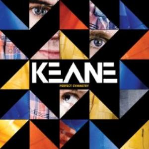
The album artwork below is from the band "Keane", for their third album "perfect symmetry". The layout of the artwork is of many triangles filled with one of three different features, whether it be a vibrant colour, an image of a section of someones face, or a solid black fill. The vibrant, different colours will attract the reader to album, this is as bright, attractive colours catch the audience's eye as they stand out. The randomly dotted images of parts of Tom Chaplin's (frontman of "Keane") face give another effect. The positioning and the actual images themselves give an iregular feel for the audience, this is as the facial features are mixed about on the CD cover and even have Tom Chaplin looking up at his own mouth. Then the solid black triangles are used the break up the other two effects and emphisise them more, making the overall image stand out. Then the band name stands out in the center of the image due to being bold in a solid white font colour and also being printed in the band's iconic font. The album title is then printed much smaller below the band's name in a vibrant yellow colour.
I believe the overall effect of this album art is to emphisise a more iregular approach on the album. Tom Chaplin has been quoted as saying he wanted to take a more "organic approach" on the album, and so by the album giving this unorthadox, block-type effect, along with vibrant, attractive colours, the artist (korean, Osang Gwon) has achieved this goal.
This has inspired me for my own ideas as I like how Osang Gwon has managed to create this effect, as well as incorperating the frontman of "Keane", Tom Chaplin, as he is recognisable to the bands fanbase and general public.
I believe the overall effect of this album art is to emphisise a more iregular approach on the album. Tom Chaplin has been quoted as saying he wanted to take a more "organic approach" on the album, and so by the album giving this unorthadox, block-type effect, along with vibrant, attractive colours, the artist (korean, Osang Gwon) has achieved this goal.
This has inspired me for my own ideas as I like how Osang Gwon has managed to create this effect, as well as incorperating the frontman of "Keane", Tom Chaplin, as he is recognisable to the bands fanbase and general public.
Tuesday, 4 October 2011
CD album art research #1
This is the album art for "The Black Keys" album "the big come up". It features the two members of the band on the front of the cover, in a smaller frame, with the band's name above and the album title below. The band members are shown in two types of shots, the one to the left in an extreme close up, the other in a close up. Also the album art is in black and white, giving it a daunting and simplistic appearance, which is effective in the sense that it could potentially give the audience an insight to the bands genre. The low and high key contrasts also provide visual elements which attract the audience, and may have been intentially chosen as a typical reference to the band, as it is a direct link to the band's name "the Black Keys".
I am looking to take inspiration from this album art, as I am wanting to feature the band members of Cohesion on my own work. Plus I am interested by the use of the black and white effect and may decide to use this effect as well.
Monday, 3 October 2011
Storyboard #2 - Live performance
Here are some more Storyboards that Adam Lawson and myself created to show some possible ideas of shots to be used in the live performance sections of our music video. It's not a storyboard as such but more some general ideas of possible shots to be implemented. This is as I'm not sure of how the live performance shots will join with the narrative at this moment, I will wait till editing once I have all the takes together before I know how I want to edit the music video.
The annotations may not appear to clearly because of the quality of the scanning. So here is some detail of the storyboards below:
Shot 1: A close up of one band member in the foreground, with another in the background at a long shot/medium-long shot. Possible switch of focus between the two people.
Shot 2: Close up/extreme close up of a guitarist's fingers on the fretboard of a guitar. This shot will give the audience an insight to what the guitarists are playing and hopefully create a connection between the audience and the band.
Shot 3: close up/extreme close up of a guitarist's strumming/plucking. Once again, I hope this shot will give the audience an insight to what the guitarists are playing and hopefully create a connection between the audience and the band.
Shot 4: medium-close up/close up of the singer singing down the microphone on his side (profile shot)
Shot 5: medium shot of drummer through the cymbols of his drum kit. Hopefully this shot will give a good effect with the symbols shaking around the edge of the frame.
Shot 6: close up/extreme close up of a cymbol shaking in the foreground with a guitarist in the background at a medium shot/medium-long shot. Focus will be on the guitarist in the background however I may include a pull of focus back to the foreground.
Shot 7: 90 degree pan from right to left to picture shown. Possible establishing shot to show the practice room setting. band shown at a long shot at end of pan.
Shot 8: shot looking down the fretboard from the headstock (going to have the camera mounted on the headstock). Similar to shot 2 and 3, this shot will give the audience an insight to what the guitarists are playing and hopefully create a connection between the audience and the band.
The annotations may not appear to clearly because of the quality of the scanning. So here is some detail of the storyboards below:
Shot 1: A close up of one band member in the foreground, with another in the background at a long shot/medium-long shot. Possible switch of focus between the two people.
Shot 2: Close up/extreme close up of a guitarist's fingers on the fretboard of a guitar. This shot will give the audience an insight to what the guitarists are playing and hopefully create a connection between the audience and the band.
Shot 3: close up/extreme close up of a guitarist's strumming/plucking. Once again, I hope this shot will give the audience an insight to what the guitarists are playing and hopefully create a connection between the audience and the band.
Shot 4: medium-close up/close up of the singer singing down the microphone on his side (profile shot)
Shot 5: medium shot of drummer through the cymbols of his drum kit. Hopefully this shot will give a good effect with the symbols shaking around the edge of the frame.
Shot 6: close up/extreme close up of a cymbol shaking in the foreground with a guitarist in the background at a medium shot/medium-long shot. Focus will be on the guitarist in the background however I may include a pull of focus back to the foreground.
Shot 7: 90 degree pan from right to left to picture shown. Possible establishing shot to show the practice room setting. band shown at a long shot at end of pan.
Shot 8: shot looking down the fretboard from the headstock (going to have the camera mounted on the headstock). Similar to shot 2 and 3, this shot will give the audience an insight to what the guitarists are playing and hopefully create a connection between the audience and the band.
Subscribe to:
Posts (Atom)